Home Edit: Our Kitchen
May 1, 2020
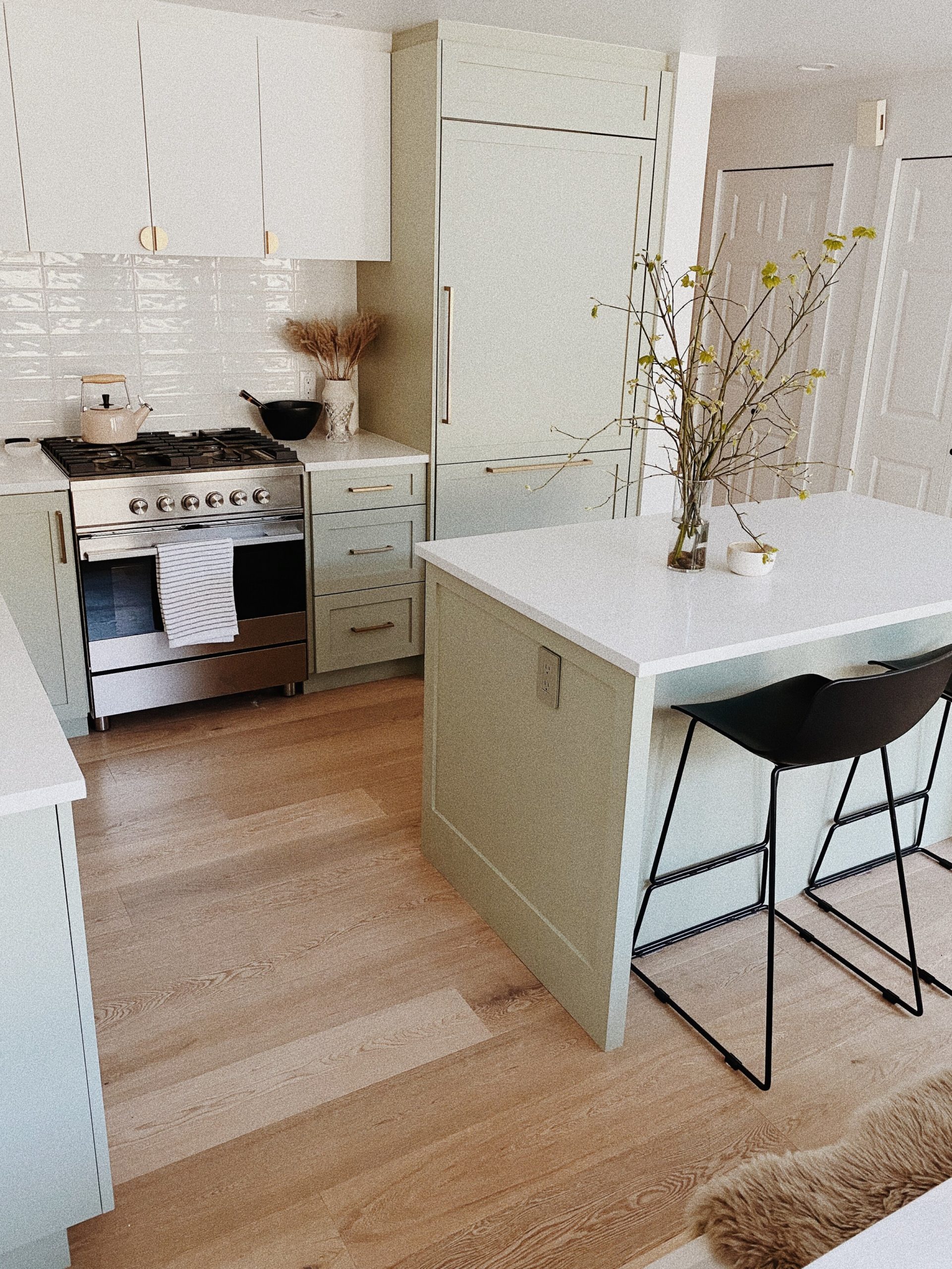
Hellooo… here is the breakdown on our kitchen that we’ve taken forever to share.
We bought our two bedroom triplex (a house split into three) back in September and got the keys in November. When we first viewed the listing in July, we really liked the open concept layout, but knew right away we would need to renovate the space because it was pretty dated. This to me was the ideal situation. We were also hesitant at first because it was the ground floor, but when we actually saw the space we were surprised to find a lot of natural light throughout thanks to the windows in each room and skylights in the main open-concept living-dining-kitchen area. Overall, we figured the house had really good bones and renovations would only need to be cosmetic so we put in our offer!
Fast forward another month after we sealed the deal and we quickly made all of our design selections in October. As soon as we were handed the keys, renovations started in full force. Phil, who works in condo and townhome development, has experience with this kind of thing and was able to hustle everything along and had our kitchen, floors, walls and two bathrooms all done at the end of December (minus a few details like doors and paint touch-ups). We moved in and we’re so happy with the results!
The Details
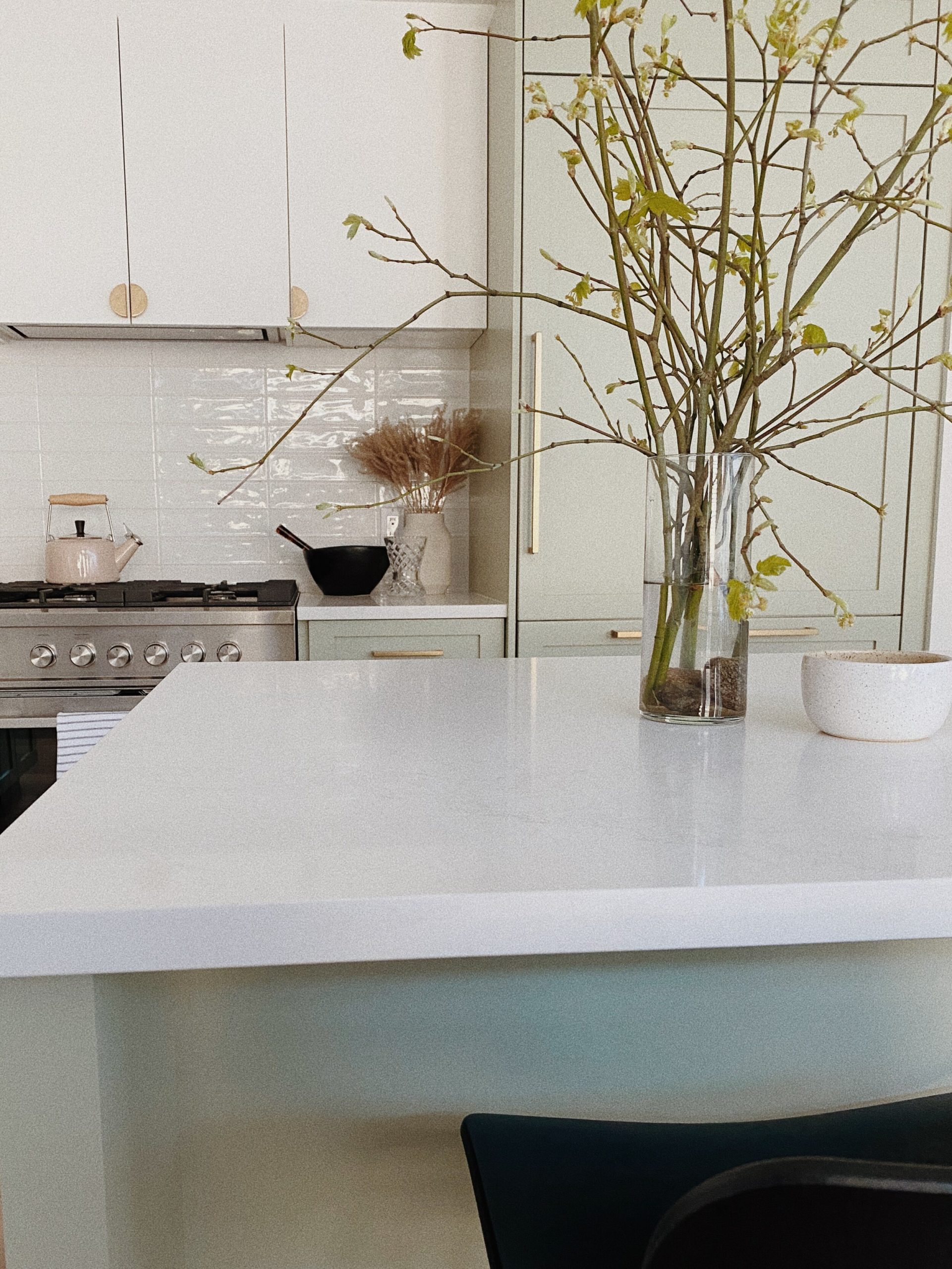
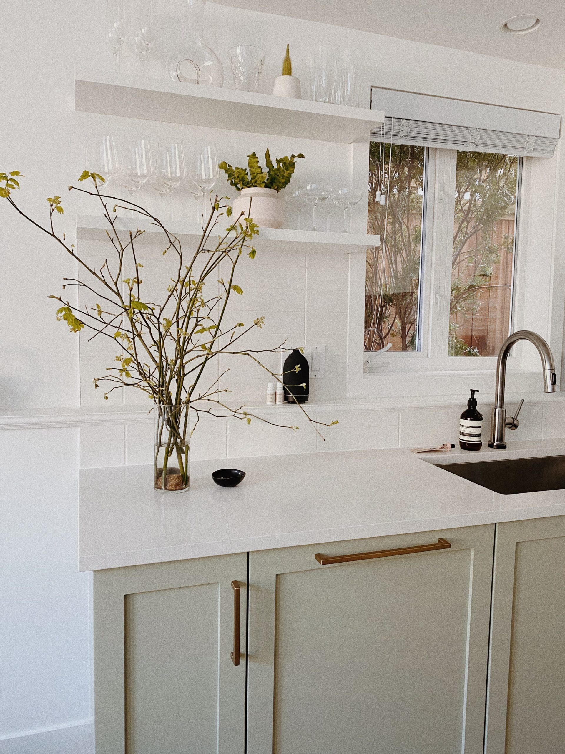
Look and Feel — Overall, we wanted a kitchen that was clean and timeless but also a little fun to reflect our personalities. I’m usually more drawn to a Scandinavian look, and Phil is happiest when there is a little colour involved. We also wanted it to feel as open and big as possible so we tore down the cabinets to the left of the window over the sink and adding in open shelving to let more of the light in. For the hood fan we went for a more minimalist feel with a with a hidden insert concealed in the cabinets. We also tore out the existing island because it was an awkward curve shape and replaced it with a clean rectangular design with room for counter stool seating.
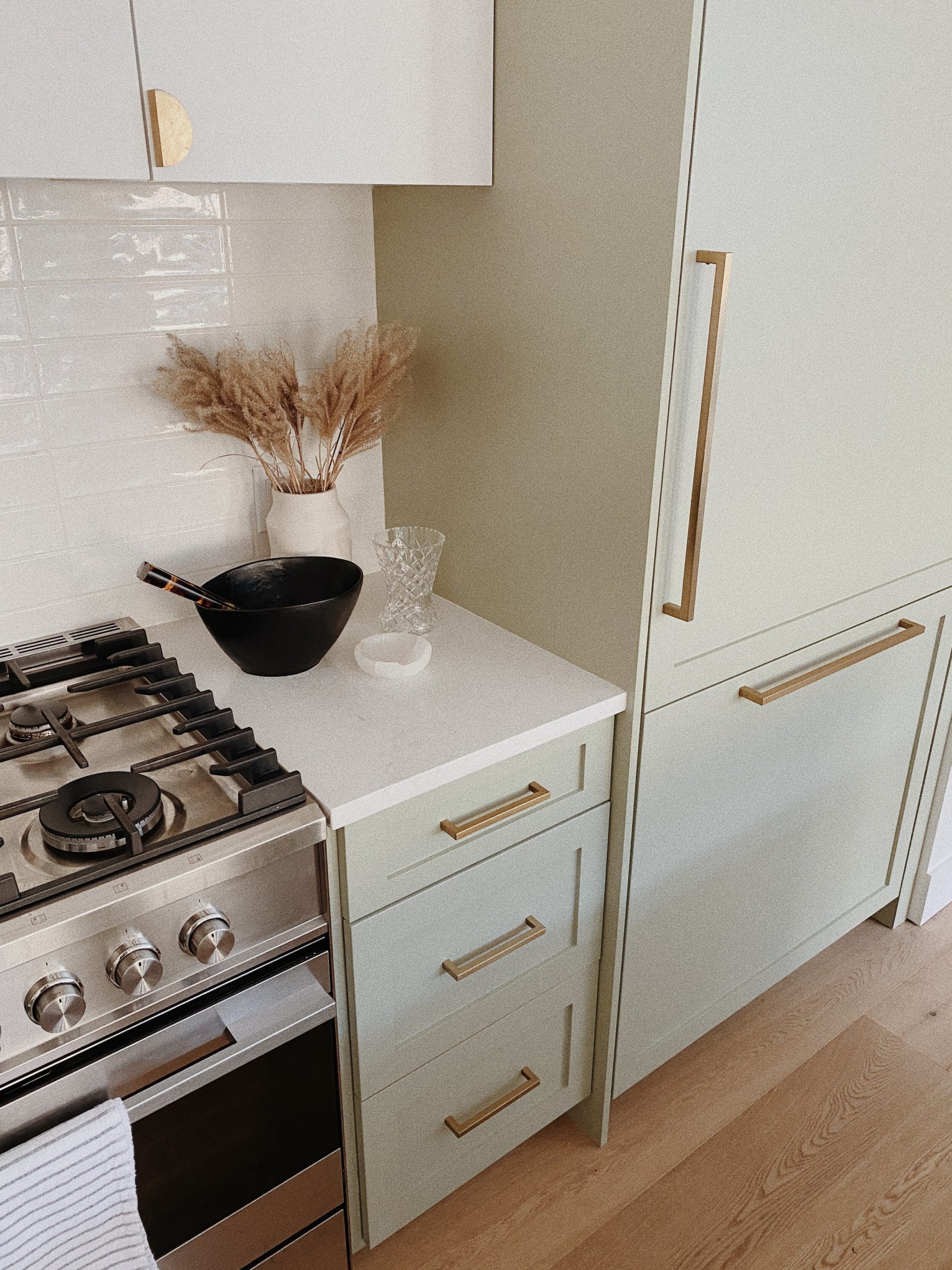
Cabinets — For the cabinets we did a full gut and replaced everything, which allowed us to really make sure we loved the functionality of the design. When designing a kitchen it’s always important to consider how you use the kitchen. Things like determining where you’ll reach for your dishes and cutlery most, keeping your spices near your stove, cutting boards near the work counter space, etc. are all important details to consider. We also knew we wanted a custom colour and tried about 6 different shades of green before landing on this muted green for the lowers and a crisp white on the uppers. We also decided to mix up the cabinet door styles with flat panels on top and modern shakers on the lowers and island portion.
Hardware — I am slightly obsessed with Sarah Sherman Samuel and knew I wanted to use her Park Studio Half Moon pulls, which we did on the more simple, flat-panel upper cabinets. They patina over time and provide a more modern. For the lowers and appliance hardware, we opted for simple brass linear pulls that went so well with the green colour and shaker style cabinet doors.
Countertops — For the countertops we went with my favourite caesarstone in a natural marble look-like-a-like, which in my opinion goes well with any colour of cabinets and kitchen style. I will forever suggest it to clients because it’s so timeless and it holds up well against stains and liquid.
Backsplash — I am always drawn to something simple and was dreaming of putting in a skinny Zellige subway tile in a vertical stacked layout. My wishes did not go as planned (which often happens) because we had a foundational ledge that couldn’t be removed through the window/sink side of our kitchen which proved to complicate the placement of a vertical tile. I settled for a stacked horizontal wavy subway tile, which I truly think you can’t go wrong with. It’s both timeless and super cost efficient.
Appliances — For appliances we went with a Fisher & Paykel gas range and panel-ready fridge. I love this brand because they have options that are more on the minimalist side when it comes to design. For our dishwasher we chose a panel-ready Bosch, which is amazing quality and super quiet when running. When designing kitchens, I usually prefer a panel-ready dishwasher and fridge because I find stainless steel to be a little cold and sterile.
Fixtures — We went with another clean and simple look with our faucet, opting for the a modern look with a touch feature. If you’ve never had a touch faucet, I highly recommend it. How many times have you had your hands completely covered in food and had to touch the handle and get it all dirty to turn the water on? With this faucet you can touch it anywhere and it will turn on. It’s amazing and really good value for the quality. For the sink we went with a really simple stainless steel, single bowl undermount sink.
I’m still working on styling our kitchen, but I’ll be sure to share details and products in a post soon!
Scroll down to see the before — it was pretty bad.
